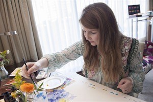
Fiona Douglas watercolour paints for future Bluebellgray designs at a hotel in Toronto on Thursday, Sept. 25, 2014. THE CANADIAN PRESS/Hannah Yoon
September 26, 2014 - 1:20 PM
TORONTO - After handpainting the lush florals and abstract prints that adorn her designs, Fiona Douglas doesn't have far to look beyond her Glasgow studio to see her creative vision truly take shape.
The creator of Scottish textile company bluebellgray has her original watercolours digitally printed on natural cloths that serve as the canvasses for an expansive array of home interiors — some of which are produced just beyond her doorstep.
"We obviously can't do it across every product because some product lines you just can't simply make in the country where you want to make them," said Douglas, whose company uses ethically approved factories for overseas production.
"But from the very beginning, all of the cushions we've done in the U.K. market are printed in the U.K. The backing cloth comes from a little mill up the road in Scotland. We sew them in Glasgow, the cushion pads come from a guy in Glasgow.
"It's very much local, and it's something that's been really important to me since the beginning of setting up this business is working with local suppliers and giving people jobs and opportunity. It's very much part of the ethos of what we do."
Bluebellgray's support of local producers has extended across the Atlantic as part of a new partnership with Hudson's Bay. All of the cushions for the retailer are locally sewn, and two of the furniture pieces in the exclusive collection — a tufted headboard with bright pink pin cushions and a colourful accent chair — are also manufactured in Canada.
"Everything is circular and I think it's a great thing to do. And I love that in Canada, we've had the opportunity to do that, to make things here to then sell in the Canadian market," the genial Douglas said during an interview in a downtown Toronto hotel suite awash with her cheerily coloured designs.
Douglas is also commemorating the special bluebellgray line with the retailer with two exclusive prints: the autumnal-toned "Arisaig" named for a village on Scotland's west coast and "Flower Field Meadow" which boasts oversized florals and bright colours. Hudson's Bay will also feature a selection of bluebellgray's other popular designs in duvet sets, piped sheeting and quilts.
Douglas has eschewed following the masses or trends and remains committed to her own creative vision.
"I never look at trend boards. I never look at what's coming through because I don't want to have that outside influence affecting what I do. I try and keep my inspiration quite pure," she said. "So the inspiration could be going to see a beautiful art exhibition or a lovely book that I've read.
"I think that by keeping the focus on my ideas and keeping them natural, it means you're not swayed by trends. And then the brand remains much more true to the heart and soul of what it's about."
While Douglas does create abstract designs, her boldly hued florals have been a distinct brand signature. While some may associate use of blooms with warmer-weather style, Douglas said she sees the beauty of florals in their ability to be incorporated year-round.
"There's nothing better on a cold winter day (than) if you come into your home and it's full of bright colour and florals. It's going to make you feel good," she said. "I would say the best way to deal with that if you're a little bit worried is use layering. Use quilts and use throws to add texture and to layer on top of your florals, and that's what will add your coziness if you're wanting this cosy feeling for autumn and winter."
Douglas said individuals shouldn't shy away from mixing prints in the home — provided they work with different scales.
"You can maybe have a really lovely large-scale print on your bed and then maybe a large-scale print on your cushions as well. And then you have a smaller scale print on the rug or maybe on your wallpaper."
Painting the wall behind the bed in a deep hue can also act like a blank canvas for more colourful prints that may be showcased on bedding, she noted.
"If you keep a natural colour palette running throughout everything, then there will be this beautiful co-ordination that comes together," she said. "That's the most important thing for getting a coherent look in a room is to have the colours that all work together.
"It doesn't necessarily have to be the same colour. It doesn't necessarily have to be all shades of blue. You can choose things that are all in the same colour family or the opposing colour family. As long as they're in the same tone then they'll work in your room."
Follow @lauren_larose on Twitter.
___
Online:
www.bluebellgray.com
News from © The Canadian Press, 2014