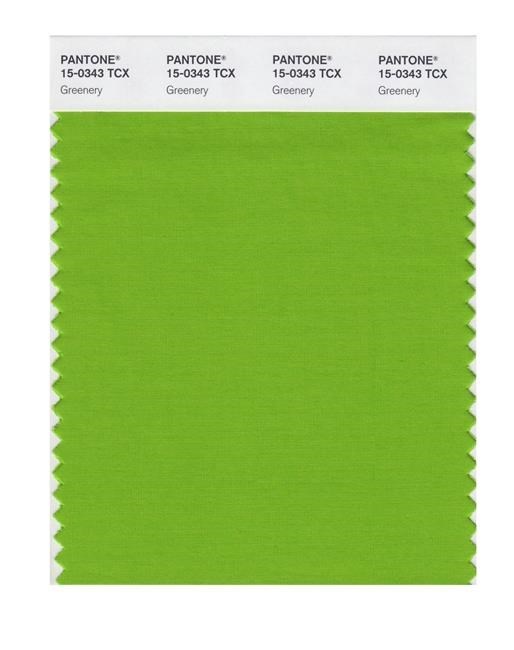
This image released by Pantone shows a color swatch called "greenery", which has been named as the color of the year for 2017 by the Pantone Color Institute. The vibrant green with yellow undertones is an answer, of sorts, to bruising 2016, signaling a yearning to rejuvenate, and to reconnect to both nature and something larger than oneself, said Laurie Pressman, the institute's vice president. (Pantone via AP)
December 08, 2016 - 5:13 AM
NEW YORK - Amid social, political and environmental tumult around the world, the Pantone Color Institute on Thursday plucked fresh and zesty "greenery" as the colour of the year for 2017.
The vibrant green with yellow undertones is an answer, of sorts, to bruising 2016, signalling a yearning to rejuvenate, and to reconnect to both nature and something larger than oneself, said Laurie Pressman, the institute's vice-president.
"It's a realization for many people," she said in an interview Wednesday. "This country is politically divided, and we see that around the world. It's not just us. There's a real division in terms of globalization and this desire to pull back from globalization. It's Brexit. It's what we just saw in Italy."
The experts at the institute, which advises a variety of industries on the use of colour from fashion and home design to packaging and product development, have been choosing a colour of the year since 1999. It's a way to conjure the emotions that colours evoke. The team at Pantone, based in Carlstadt, New Jersey, scouts trends through the year in media, on runways and at trade shows around the world.
The colour "greenery," similar to chartreuse, is well represented in the first buds and grass blades of new spring, but it also plays out in history at times of major cultural shifts, including the suffrage movement and flapper era of the 1920s and the war and racial justice protest movements and psychedelia of the '60s and '70s.
"It's been there during times of bold change, when people are exploring," Pressman said.
The hue is in contrast to the soft, serenity-inducing dual choices of "rose quartz" and "serenity" blue as the colours of the year for 2016.
In addition to the emerging recycle-and- share economies, we have green rooftops, green spaces and indoor vertical farming. In home decor, there's a trend to connect with the elements outside through open spaces and vast windows, and a desire to bring nature inside through forestry murals and living moss walls, Pressman said.
On the industrial side, both Skoda and Mercedes showed bright green cars for 2017. For the kitchen, Pantone spotted its shade in appliances, including a Keurig coffeemaker, and in cookware.
And in fashion, menswear designers have played into the idea of gender fluidity through prints and accessories of bright greens, along with the creators of womenswear and beauty products, ranging from the couture of Oscar de la Renta in a leaf-embellished gown to bright green shades for eyes, nails and lips.
Katy Perry, Kylie Jenner and Lena Dunham have all taken turns dying their hair bright green. Last year, a cologne from the Diana Vreeland brand came in green and was dubbed "Bold."
The shade also symbolizes the organic and health frenzy in cleaning products and food — hello matcha! — coupled with efforts to rethink food waste in restaurants and processing plants.
In the tech and digital spaces, the colour pops up in products like earbuds and in logos and advertising for apps and startups, Pressman said.
"We saw it always as a bold colour," she said, "but it may not have been accepted by some people. Today we look at this as a colour associated with innovation. It takes on a whole different feeling."
News from © The Associated Press, 2016